If you haven't already seen Part I of this collection, click here to get a slice of that holiday goodness!
After the jump is Part II of the China Glaze Holiday 2010 collection. If you thought it couldn't get better, strap yourself in for a bumpy ride.

Showing posts with label Plum. Show all posts
Showing posts with label Plum. Show all posts
Wednesday, November 10, 2010
Tuesday, July 6, 2010
BYS - Matte Deep Plum
Call me persistent. Call me crazy. Call me Jacie. But I just can't let go of the matte trend.
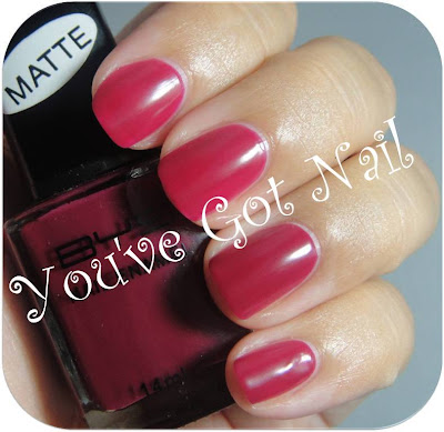

This is BYS's Matte Deep Plum. I'm not sure of the name since this really doesn't look like any plum - any edible plum I should add - I've seen. It's definitely more of a raspberry. But maybe I'm blind so, you know, don't listen to me.
At first I was disappointed with this. It just seemed... well.....boring. But it's definitely grown on me and I've worn this a number of times. It's classic but the matte gives it a little twist of interest.
Naturally, I glossed this up because I love glossing a good matte. Peep it after the jump.


This is BYS's Matte Deep Plum. I'm not sure of the name since this really doesn't look like any plum - any edible plum I should add - I've seen. It's definitely more of a raspberry. But maybe I'm blind so, you know, don't listen to me.
At first I was disappointed with this. It just seemed... well.....boring. But it's definitely grown on me and I've worn this a number of times. It's classic but the matte gives it a little twist of interest.
Naturally, I glossed this up because I love glossing a good matte. Peep it after the jump.


Wednesday, June 16, 2010
Swatch Watch - Coral Colours **Voting Now Open**
I know my Australian readers are thinking something along the lines of 'WTF?' 'Coral Colours!' My nanna wears Coral Colours'. 'She's finally lost it. Jacie, that is, not my nanna'.
And you'd be right. Coral Colours has an unfortunate reputation for being nanna-ish in its colour selection.
However, they have recently started rebranding themselves and the results are on-trend, high quality lacquers that are to die. The bottles still need work (seriously, a gold handle) but I'm seriously impressed with this brand's re-invention.
So much so that they are this month's Swatch Watch lacquer.
The rules of this competition are the same as always.
1. Pick your favourite Coral Colours lacquer after the jump.
2. Scroll down to the entry form.
2. Select your favourite Coral Colours lacquer from the drop down box.
3. Fill in your name and email address.
4. Click 'Submit Entry'.
5. Do a happy dance because you've just got your entry in. This is mandatory - YOU MUST DANCE.
6. This competition is open to everyone (so long as your postal service can accept nail polish) and will close on 5pm, Wednesday 30th June 2010, Australian Standard Time.
If you're the lucky winner, you will win the lacquer you voted for PLUS you can choose one other lacquer from the ones swatched.
And now, for the additional prize. If you are selected as the winner AND you are also a follower of YGN (this is mandatory if you want to win the additional prize - I want to be able to offer followers an additional 'Mwah, I love you lots' prize), you will receive, in addition to the two lacquers of your choice, a bottle of Pewter Polish.
So quit reading, start peeping and vote after the jump!
And you'd be right. Coral Colours has an unfortunate reputation for being nanna-ish in its colour selection.
However, they have recently started rebranding themselves and the results are on-trend, high quality lacquers that are to die. The bottles still need work (seriously, a gold handle) but I'm seriously impressed with this brand's re-invention.
So much so that they are this month's Swatch Watch lacquer.
The rules of this competition are the same as always.
1. Pick your favourite Coral Colours lacquer after the jump.
2. Scroll down to the entry form.
2. Select your favourite Coral Colours lacquer from the drop down box.
3. Fill in your name and email address.
4. Click 'Submit Entry'.
5. Do a happy dance because you've just got your entry in. This is mandatory - YOU MUST DANCE.
6. This competition is open to everyone (so long as your postal service can accept nail polish) and will close on 5pm, Wednesday 30th June 2010, Australian Standard Time.
If you're the lucky winner, you will win the lacquer you voted for PLUS you can choose one other lacquer from the ones swatched.
And now, for the additional prize. If you are selected as the winner AND you are also a follower of YGN (this is mandatory if you want to win the additional prize - I want to be able to offer followers an additional 'Mwah, I love you lots' prize), you will receive, in addition to the two lacquers of your choice, a bottle of Pewter Polish.
So quit reading, start peeping and vote after the jump!
Tuesday, June 8, 2010
Glimmer Shimer - 'Bad Boy'
This lacquer from Glimmer Shimmer (sorry I don't know anything else about this brand) is nameless. If you have a great name for the little orphan, let me know in the comments. I'm naming him Bad Boy. Read on to find out why.


Now, I really love this colour on the nail. It's a beautiful, burnt brown with shimmer all the way through it. It only took two coats to get to opaque and a high shine.
BUT....
Check out the bottle. Look closely. It's plum right? And now look at my nails. Not plum. This lacquer is so bizarre. It's like two different colours and I can't figure out how the heck that happened.
Secondly, the formula itself is weird. For those of you familiar with gel nails, that is the consistency of the lacquer. It's so thick that it makes a quick manicure out of the question.
Finally, and compounding the formula issue, the brush is a weapon of mass cuticle destruction. The brush on this is like a toilet brush. It spreads the lacquer everywhere, resulting in me having to do major cleanup.
This lacquer is like a bad boy at a bar. You know you shouldn't but it's just too hot to ignore. So I will indulge, despite the pain it brings, because life is too short not to enjoy bad boys. Even ones who look totally different in the cold light of day. ;-)


Now, I really love this colour on the nail. It's a beautiful, burnt brown with shimmer all the way through it. It only took two coats to get to opaque and a high shine.
BUT....
Check out the bottle. Look closely. It's plum right? And now look at my nails. Not plum. This lacquer is so bizarre. It's like two different colours and I can't figure out how the heck that happened.
Secondly, the formula itself is weird. For those of you familiar with gel nails, that is the consistency of the lacquer. It's so thick that it makes a quick manicure out of the question.
Finally, and compounding the formula issue, the brush is a weapon of mass cuticle destruction. The brush on this is like a toilet brush. It spreads the lacquer everywhere, resulting in me having to do major cleanup.
This lacquer is like a bad boy at a bar. You know you shouldn't but it's just too hot to ignore. So I will indulge, despite the pain it brings, because life is too short not to enjoy bad boys. Even ones who look totally different in the cold light of day. ;-)

Friday, May 21, 2010
Elianto - Thistle
Elianto's Thistle was gifted to me by the lovely EmmaJoy who, incidentally, is one of the best swappers out there! She's also a total sweetie.


When I first pulled the brush out of the bottle I immediately thought 'Deep breath, Jacie. This is going to be a pain in the a**'. And it wasn't, which just shows that I know nothing.
The first coat of this was clear but the second resulted in an opaque finish. Because it is somewhat thin, it dries very quickly and is Seche Vite dry in around 5 minutes.
And the colour is beautiful. It's not quite a pink and it's not quite a lavender. I call it a lavendink. Heart this like I heart Michael Fassbender.
Of course, I could not leave well enough alone. For me, more is always more. I bedazzled this with some of Nailene Nail Art. Violet Le Beaux - this one is for you!

Definitely not an everyday look but I am totally loving the Nailene nail art. It's easy and it always looks good.
The nail art featured in this review was provided by Nailene. For more information on YGN's Disclosure Policy, please click here.


Diffused Light
When I first pulled the brush out of the bottle I immediately thought 'Deep breath, Jacie. This is going to be a pain in the a**'. And it wasn't, which just shows that I know nothing.
The first coat of this was clear but the second resulted in an opaque finish. Because it is somewhat thin, it dries very quickly and is Seche Vite dry in around 5 minutes.
And the colour is beautiful. It's not quite a pink and it's not quite a lavender. I call it a lavendink. Heart this like I heart Michael Fassbender.
Of course, I could not leave well enough alone. For me, more is always more. I bedazzled this with some of Nailene Nail Art. Violet Le Beaux - this one is for you!

Diffused Light
Definitely not an everyday look but I am totally loving the Nailene nail art. It's easy and it always looks good.
The nail art featured in this review was provided by Nailene. For more information on YGN's Disclosure Policy, please click here.
Saturday, May 1, 2010
butter LONDON - Perfect Prezzie Take II
I don't know if you guys are enjoying me revisiting old lacquers, but I really love digging through my stash, finding a lacquer that I did a monstrous swatch for and then trying to do it justice a second time around.
butter LONDON is a brand I adore but I did not like the look of their last Sheer Collection and, so, I haven't indulged in any butter LONDON goodness at all this year.
But, oh, how I miss my butter LONDON, so here is Perfect Prezzie (from the Christmas 2009 Collection) for you all.


Whilst I really like this lacquer and love the way it looks on the nail, it is one of those lacquers that looks better in the bottle. In the bottle, there's rivers of gold swimming through the plum. On the nail, the gold all but disappears.
Irregardless, this is beautiful, sexy and sophisticated. Please, butter LONDON, bring out more of these!
butter LONDON is a brand I adore but I did not like the look of their last Sheer Collection and, so, I haven't indulged in any butter LONDON goodness at all this year.
But, oh, how I miss my butter LONDON, so here is Perfect Prezzie (from the Christmas 2009 Collection) for you all.


Diffused Light
Whilst I really like this lacquer and love the way it looks on the nail, it is one of those lacquers that looks better in the bottle. In the bottle, there's rivers of gold swimming through the plum. On the nail, the gold all but disappears.
Irregardless, this is beautiful, sexy and sophisticated. Please, butter LONDON, bring out more of these!
Monday, April 12, 2010
Boots No.7 - Colour Miracle in Miracle Plum


Diffused Light, without Top Coat
I have some weird alchemy for you today, in the form of Boots No.7's Colour Miracle.
According to the PR on the Boots site,
By day, the light, pretty shades are demure enough for the office. At night, paint on a quick coat of clear varnish and it transforms into a spectacularly deep, glossy shade.So I can be a nun by day and a slapper by night. Sounds good so far.
The without top coat colour, which you can see above, is a lovely burgundy inspired plum, with hints of rust throughout. This is a genuine 'one coat and it is opaque' style of colour (although I did two because I mucked up the first coat). I feel a little like Joan Collins in her seminal Alexis Colby role wearing this. And I mean that as a good thing.
But did the top coat change the colour? Would I become the slapper I was so hoping to be? Check out the results after the jump!
Monday, March 15, 2010
American Apparel - Berry

I literally had my order ready to go when I found out about the recall. Which disappointed me no end because I had heard such amazing reviews for their lacquers.
Well, they're back! And, in Australia anyway, American Apparel have reduced the price (from 3 for $28 to 3 for $22). So I naturally went nuts and picked up six. I'll be showcasing three of them throughout this week, and save the others for over the next couple of weeks.
Berry is just the kind of deep and rich plum I have a billion of, but never get sick of.
Formula wise, this is wonderfully creamy and smooth. Two coats and you're opaque. And it dries to a high shine, as seen here.
My only qualm? The brush is a lame duck. It's uneven (which makes getting close to the cuticle hard as you inevitably get a rogue hair ruining a good finish) and way too long (which makes it hard to balance). In the end, I resorted to my old 'use an OPI Pro-Wide Brush' trick in order to clean up the finish. You can see smudging on my index and middle finger where I struggled along with the American Apparel, before resorting to the Pro-Wide for the ring and little finger, with a resultant better finish.
But, other than the brush, this is a super lacquer. I can see myself wearing this alot for the upcoming autumn and winter here in Australia.
Have you guys tried American Apparel? What did you think of them? Do you find the brushes problematic, or is that an operator error on my part?
Thursday, December 17, 2009
Mecca Cosmetica - Audrey

I think that can only mean one nail blogger.... Evil Angel. This is a fearless and bold colour and, really, Evil Angel is one of the boldest, fiercest people I know.
Audrey is such a beautiful plum. Look at that shine! That's two coats without a top coat. I think it's extraordinary. I can even make out an image of the light umbrella in the my index finger!
This is a great colour for Christmas, regardless of whether you live in the northern or southern hemisphere. It's sophisticated, easy to wear, will go with pretty much any outfit, and lasts forever on the nail.
What do you ladies think? Approve? Disapprove?
On another note, I've had a few of you email me asking what camera I am using to take my photos. I use a Canon EOS 450D SLR camera. Which I like because it takes great photos and is easy to use. I'm no photography expert so I like that I can just set this up on the tripod and - bang - good photos just emerge.
Wednesday, November 18, 2009
butter LONDON - Perfect Prezzie - Part II
 The final nail art I trialled with the butter LONDON Christmas 2009 Collection is Perfect Prezzie with a Fairylights Konad.
This is a superb colour combination. Even with my oh-so-crummy Konading, these work so well together.
The creaminess of Perfect Prezzie acts as the perfect backdrop for the more blinging Fairylights.
I fully intend to wear this to our office Christmas Party this year. I'll have the best dressed nails there!
Tomorrow, I'll be swatching my Asos Paint Pots. These are AMAZING lacquers that I truly believe will become classics over time. I can't wait to show them to you!
butter LONDON - Perfect Prezzie - Part I
 For the second time in this collection, I've had the experience of a colour not looking anything like it does in the bottle. First, it was Fairylights and, now, it's Perfect Prezzie.
In the bottle, this looks like a deep plum with swathes of gold through it. It's gloriously gothic and mysterious, like velvet. I can, seriously, sit and look at this for hours. It's magical.
On the nail, however, the gold just doesn't show through, leaving me with a fairly standard plum.
Now, don't get me wrong, this is a gorgeous colour and it looks fab on the nail. But you know what it's like when you have an image or an expectation of how something will look and, then, when it doesn't live up to those expectations there is that quiet *sigh* of disappointment.
As with all butter LONDON lacquers, the formula is a little tricky (hence my less than perfect application), but the colour is opaque in two coats and is uber shiny on the nail.
Monday, November 16, 2009
butter LONDON - Knees Up - Part II
 ** I'm back from holidays. I'm tanned (not intentionally but as a byproduct of sitting at the beach all day, albeit under an umbrella) and relaxed and ready to get back into things. I'll be going through all the lovely comments you've left this afternoon. **
One thing I love about the butter LONDON collections - well, besides the beautiful colours and finishes - is how they work together.
While the colours can appear, by themselves, disconnected and very individual, mix them with a Konad Stamper and you get some truly amazing combinations.
I've teamed Knees Up, which I trialled earlier today, with Perfect Prezzie.
I know it's hard to see in the photo (definitely click to see the larger version), but this is a beautiful combination of colours. I used a flower stamp, which I think you can just make out in the photos, and it looks like an old tapestry. I wore this for work last week and I've been complimented endlessly on how it looks. It's subtle enough not to be 'in your face' but there is an obvious textural and colour difference.
Monday, October 12, 2009
Precision - Raspberry Beret
Coming in at No. 5 of my All Time Favourite Lacquers is Precision's Raspberry Beret.
 I stumbled on this during an excursion to a seedy part of town in search of cheap OPI and China Glaze. As I was paying for my OPI and China Glaze (all bought at around half the price of what I would pay in a nicer part of town), my gaze momentarily rested upon a dusty, and rather unloved, Precision stand.
Raspberry Beret ticked all my boxes in terms of colour and, really, when a lacquer is named after a classic Prince song, I defy anyone to be able to resist. It was also cheap (around $7) so I figured (as I silently sang the lyrics to Raspberry Beret in my head), 'Why have I got to lose?'
I loved this colour so much that, the next weekend, I went back to that seedy part of town and bought four more. That's love. Or an illness. I'll let you decide.
Raspberry Beret is a deep plum creme that would suit almost any skin tone.
This is opaque in one coat, however, I always apply two just to give me a little more richness and depth. And, with a good topcoat, you can expect this to last up to five days before you start to see tipwear.
Why this makes it into my Top 5 is not just the colour and the quality, although that certainly helps. What sets this apart from other colours in my collection is its versatility. This is a colour you can wear during the day at work and and at a formal event in the evening.
Unfortunately, this is a bugger to find. Only a few stockists still hold the product, although there seems to be a few lurking on eBAY at any given time. Thankfully, I have a whole stack of these in my collection so I won't be running out in a hurry.
 I stumbled on this during an excursion to a seedy part of town in search of cheap OPI and China Glaze. As I was paying for my OPI and China Glaze (all bought at around half the price of what I would pay in a nicer part of town), my gaze momentarily rested upon a dusty, and rather unloved, Precision stand.
Raspberry Beret ticked all my boxes in terms of colour and, really, when a lacquer is named after a classic Prince song, I defy anyone to be able to resist. It was also cheap (around $7) so I figured (as I silently sang the lyrics to Raspberry Beret in my head), 'Why have I got to lose?'
I loved this colour so much that, the next weekend, I went back to that seedy part of town and bought four more. That's love. Or an illness. I'll let you decide.
Raspberry Beret is a deep plum creme that would suit almost any skin tone.
This is opaque in one coat, however, I always apply two just to give me a little more richness and depth. And, with a good topcoat, you can expect this to last up to five days before you start to see tipwear.
Why this makes it into my Top 5 is not just the colour and the quality, although that certainly helps. What sets this apart from other colours in my collection is its versatility. This is a colour you can wear during the day at work and and at a formal event in the evening.
Unfortunately, this is a bugger to find. Only a few stockists still hold the product, although there seems to be a few lurking on eBAY at any given time. Thankfully, I have a whole stack of these in my collection so I won't be running out in a hurry.
Subscribe to:
Posts (Atom)
LinkWithin
