I have a lovely friend who is living in England and has a formal occasion to attend in a couple of months. Apparently, royalty (the English type, not the good Prince type) will be there so she is going all out buying a new frock, shoes, bag and accessories.
When it came to the manicure, she decided to seek my advice. I told her to find a picture of a manicure she liked and I'd see if I had equivalent colours to send her. And this is what she came up with.
Yep, she wants a manicure like Ke$ha. Putting aside the obvious question of why her muse is someone who looks like they spend much of their free time in a ditch, I quite like this manicure.
So I gave it a try. Check out the results after the jump!
Showing posts with label Bloom. Show all posts
Friday, March 19, 2010
Thursday, March 4, 2010
Bloom - Mena
Behold, Bloom's Mena! I feel like trumpets should be heralding the arrival of this truly spectacular lacquer.
I absoutely have not done justice to Mena in this photo. This comes through in the photo as a black with silver glitter. In reality, there are a billion different colours of glitter in this lacquer, from red to green to blue.
Definitely click to see the larger version (on the larger version, the glitter is clearer).
Formua wise, I think this is the best Bloom I've come across. This is a true, one coat and it's opaque lacquer. No kidding, the swatch on the right is one, glorious coat.
It's smooth, silky and bringing sexy back, one piece of micro-glitter at a time. This is a clear star for Bloom. If they ever choose to discontinue it, I will wage a one woman protest (I might be able to trick Nixxy into coming with me if I promise her hot men) outside Bloom HQ.
What do you guys think? Do you like Bloom's Mena?
Tuesday, March 2, 2010
Bloom - Bonnie
I actually bought Bloom's Bonnie because I thought it might be a Nars Purple Rain dupe. As it turns out, Bonnie has a twin sister in Illamasqua's Phallic and looks nothing like Purple Rain.
Like Phallic, Bonnie is a midnight blue with shimmery light blue glitter throughout.
The formula on this is utter perfection. It glides on smoothly, dries quickly and you can get away with one coat (although this swatch is two coats).
I had put Bonnie side by side with my previous swatch of Phallic, but the lighting between the two swatches was crazy different and I didn't have time to redo Phallic in the same lighting (if you want a really good swatch comparison, click here).
In short, it's safe to say that Bonnie and Phallic are the same lacquer. There are minor differences (Phallic is a little more vibrant and 'richer'), but, really, only someone looking really closely would notice the difference.
This is a fabulous lacquer. It's sexy, sophisticated and I feel like a total vixen wearing it (which, at my advanced age, is an achievement).
How do you guys like Bonnie?
Monday, February 8, 2010
Bloom - Audrey + Nail Art
The first of my Valentine's Day manicures uses Bloom's Audrey.
My friend N messaged me at work a couple of weeks ago and said 'I'm wearing this amazing Bloom colour called Audrey'. I immediately conjured up images of China Glaze's For Audrey so you can imagine my surprise when I found out that Bloom's Audrey is a classic raspberry creme.
This is a beautiful, timeless colour. It's the kind of colour you wear if you want to keep things elegant and, yet, don't want to stick to pinks or taupes.
Formula-wise, this is Bloom at its best (with one flaw which I'll go into later). The formula is neither too runny nor too thick, making it infinitely workable on the nail. It dries super quickly and to a high shine. The swatch on the left is sans top coat.
I only have one problem with this. The opacity. The swatch here is three coats and I can still see a visible nail line on my ring and little finger. Not badly, and I suspect no-one else but me would see this, but it still bothers me. A little.
I suspect this isn't a unique colour by any stretch of the imagination so, for my international readers, if you have a dupe, post a link to it in the comments so that we may all 'ooooh', 'ahhhh' and delight in raspberry creme goodness.
I also trialled some nail art with this manicure. I bought some cute little stickers from a $2 shop and thought this was the perfect colour to use them with.
Unfortunately, in this photo, the manicure looks a little nail wreck-alicious but, in person, this is such a cute little manicure. It so reminds me of Fiji and the lovely flowers the waitresses in the resort restaurants would insist on putting in my hair.
Ladies, how do you like Bloom's Audrey. Are you planning a special manicure for Valentine's Day?
My friend N messaged me at work a couple of weeks ago and said 'I'm wearing this amazing Bloom colour called Audrey'. I immediately conjured up images of China Glaze's For Audrey so you can imagine my surprise when I found out that Bloom's Audrey is a classic raspberry creme.
This is a beautiful, timeless colour. It's the kind of colour you wear if you want to keep things elegant and, yet, don't want to stick to pinks or taupes.
Formula-wise, this is Bloom at its best (with one flaw which I'll go into later). The formula is neither too runny nor too thick, making it infinitely workable on the nail. It dries super quickly and to a high shine. The swatch on the left is sans top coat.
I only have one problem with this. The opacity. The swatch here is three coats and I can still see a visible nail line on my ring and little finger. Not badly, and I suspect no-one else but me would see this, but it still bothers me. A little.
I also trialled some nail art with this manicure. I bought some cute little stickers from a $2 shop and thought this was the perfect colour to use them with.
Unfortunately, in this photo, the manicure looks a little nail wreck-alicious but, in person, this is such a cute little manicure. It so reminds me of Fiji and the lovely flowers the waitresses in the resort restaurants would insist on putting in my hair.
Ladies, how do you like Bloom's Audrey. Are you planning a special manicure for Valentine's Day?
Friday, December 4, 2009
Bloom - Chicago + Matte
I'm wondering if you guys ever get sick of me telling you how much I love colours.
If so, then close your browser now because you're about to hear me gush. Again.
Bloom's Chicago as a matte = pure matte magic.
As I suspected earlier, the purple base in this flattens with the matte, leaving the glitter almost floating on top. Without sounding like I'm hitting the hooch, this is like some kind of beautiful, purple moon rock.
Definitely click to see how the glitter is almost suspended within the manicure. It's lovely.
So, what do you ladies have planned for the weekend? My light umbrellas arrived so I'm going to spend alot of the weekend getting them set up so that I can start taking some really fab nail photos. Then, on Sunday, we're having a BBQ at our house - very typical behaviour from Australians at this time of year!
Bloom - Chicago
I think I saved the best for last.
Bloom's Chicago is a fabulous dense purple glitter. Definitely click on the image to see it in all its glittery goodness.
No fooling, how awesome is this manicure?!
Like Seoul and Las Vegas, this is opaque in two coats, albeit it dries to an extraordinarily rough finish. If you want a smooth finish, definitely file off your nails gently to eliminate the glitter hangover, and then apply a top coat (I always find Seche Vite works brilliantly on glitters).
I can't wait to see how this looks as a matte. Because the base colour of the lacquer itself is a purple hue, I suspect it's going to be amazing.
Wednesday, December 2, 2009
Bloom - Las Vegas + Matte
Oooooh, I think I'm starting to like glitter mattes more with this manicure. Thanks to the lovely Gilded Angel for convincing me that I needed to keep on going with this!
Whereas the glossy version is all about the bling, the matte top coat makes this like the Mona Lisa. Everytime I look at it, there's a feature or element that I just haven't seen before. It's magical.
Although there is still a sheen to the lacquer, the glitter almost seems trapped in the lacquer. Without sounding too biblical, it's like a little stain glass window on my nails.
So maybe my previous theory was a little premature. Maybe glitters can look fab with a matte top coat.
I know I will be doing more matte manicures with this colour from now on.
What do you guys think?
Bloom - Las Vegas
Like Seoul, this is a dense glitter. It is opaque in two coats and, quite frankly, I think it could be used to guide planes in. That's how bright this is on the nail.
At first I thought this might be a dupe for butter LONDON's Rosie Lee. However, looking at the two of them side by side, it becomes evident that Las Vegas is a much lighter pink and lacks the 'foil' effect that so defines Rosie Lee.
Quality wise, this is very typical for a dense glitter. The finish is rough and there is occasional hanging glitter. But I can live with both of these things with that colour payoff.
Viva Las Vegas! Mmm, yeah sorry for that cliche.
Monday, November 30, 2009
Bloom - Aspen + Matte
A short note to Cecilia and Lucy, who won the November Giveaway. I posted your lacquers today so you should receive them in the next week or so!
So, ladies, we have our first matte experimental, featuring Bloom's Aspen with an Essie Matte About You Topcoat.
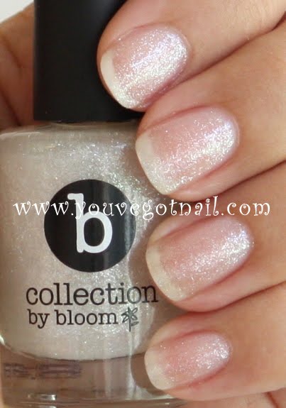
At first, I was so disappointed with this. Because Aspen is a pure white glitter, with no other colours, the matte top coat just flattened the colour, leaving it looking like ceiling tiles. It seemed like all of the magic was lost.
However, I've gotten used to this and, whilst it's not what I expected and/or wanted, it has its own unique charm. For a start, as a gloss glitter, Aspen does not work in a conservative work environment. However, with a matte topcoat, it works beautifully and is totally appropriate.
And, really, I'm probably getting too old to be wearing blinging glitters. This is a great compromise between wanting to stay true to my glitter roots but making it more age appropriate (this is just my opinion, I'm a little conservative when it comes to glitters).
In short, this works. Sort of. What do you guys think?
Bloom - Aspen
Bloom released it's B Collection a few weeks ago. Despite launching a mammoth 70 shades, I found that a number were repackaged hues from other collections and/or colours that form part of Bloom's core colour range, hence I didn't pick up many.
What I did splurge on was some of the glitters. I've previously trialled Seoul, whose 'opaque in two coats' grey glitter raised my hopes that all the glitters would be opaque in two coats.
As you can see, however, not all glitters are created equal. Aspen is a white glitter that, funnily enough, reminds me of snow.
Unlike Seoul, this is not an opaque in two coats glitter. It's not even an opaque in four coats glitter. The swatch here is four heavy coats and there is still one heck of a visible nail line.
As disappointing as it is that this isn't opaque, not all is lost. This is a great top coat for creme lacquers. Because it lacks any yellow undertones, it gives other lacquers a tinsel-esque sheen. Which makes it perfect for the upcoming holiday season.
So ladies, what do we think of Aspen?
Friday, November 6, 2009
Bloom - Seoul
I have a love/hate relationship with Bloom. It's really pretty simple, really. I love their lacquers, but I hate their prices. That doesn't stop me buying them, but it doesn't stop me whinging about them either. :-)
Anyway, Bloom recently released their B Collection at Target. Although some of the colours are unique, others are old colours repackaged under different names. 'Adelaide' is Jessica Mauboy's Sangria. Edinburgh is Jessica Mauboy's Myrtle Green. Corsica is Miss Connie's Pop Art Blue. Not that I mind, however. The lacquers in this collection are only marginally smaller than the usual Bloom colour (11mls versus the normal 12mls), but cost a whopping $5 less. I can get behind that!
With 70 choices, you can imagine my panic standing in Target. I kinda wanted all of them. In the end, I settled for four of the glitters that, for me, stood out as being utterly unique.
Seoul is a dense silver glitter. And I mean dense. This is a glitter that is opaque in two coats, as shown here. Seriously, that's only two coats. Amazing, huh?
As you would expect with such a dense glitter, the finish on this is rough. And there are a few hanging edges. Nothing that a gentle file and a coat of Seche Vite can't fix.
As for why it's called Seoul..... don't ask me. I have no idea. But I love it all the same!
Monday, October 5, 2009
Skin Food - RE107
RE107 (someone please explain to me why Asian lacquer brands have such unsexy naming conventions) is a deep red jelly.
Fine glitter particles seem to light the polish from within. When I applied it, it was almost like the glitter was suspended in the nail polish. I couldn't help but stare at my nails all day.
Application was a breeze with this. It dries super fast so, by the time you've finished the first coat, your nails are ready for the second.
It takes two coats to become opaque although, if you really want no visible nail line, I'd recommend three coats.
Longevity is ok. This lasted about two days before I started to see some minor tipwear. But that was easily fixed with a quick touch up on the tips and a further topcoat. This is the kind of polish you can put on on Monday and still be wearing on Friday.
Best of all about this? It's a pretty good - and far cheaper - dupe for Bloom's Sangria.I've lined up both polishes side by side and, really, in the photos there is minimal difference between the two.
In person, RE107 is more of a 'true' red than Sangria, which has huge dollops of pink and gold running through it.
However these differences are only perceptible if you are really looking for them. You could easily get away with wearing the RE107 (which is much, much cheaper - I paid $3 for RE107 on eBay) rather than Sangria, and save yourself a few dollars.
So what do you guys think? Do you like RE107 from Skin Food? Do you think it's a good dupe for Sangria?
Thursday, September 24, 2009
Bloom - Miss Connie Neon Orange
The final polish from Bloom's Designer Collection is Miss Connie Neon Orange.
Neon Orange isn't quite a bright orange. It isn't quite a red either. It's what I would call an orange with very strong red undertones.
Unlike it's Pop Art Blue cousin, application is a breeze on this one. You could probably get away with one coat but, if you really want the orange to come through, then two is best.
This is also the colour I get the most compliments on. Normally, I dislike oranges. I find they just don't complement my skin tone.
But, thanks to the generous dollops of red in this, Neon Orange actually makes my hands look more tanned than they really are. I love it when a nail polish doesn't just make my nails look pretty!
This is also a great polish for longevity. I wore this when I spent the afternoon at my son's kinder washing paint brushes. Even after two hours in soapy water, there was no tip wear or chipping. That's impressive.
I've embedded yet another Sneaky Sound System video below, only because the gorgeous Miss Connie is wearing an orange frock in the video. I love that this collection isn't just a marketing ploy. The colours she has designed appear to be colours she actually wears in person.
Wednesday, September 23, 2009
Bloom - Miss Connie Pop Art Blue
Another Australian celebrity that has joined forces with Bloom for its Designer Collection is Miss Connie, of fab Australian band, Sneaky Sound System.
Pop Art Blue is hands down, pants down, my favourite Bloom nail lacquer. Look at that neon glow!
Unlike other Designer Collection hues, Sangria and Myrtle Green, (which are effectively one coat and they're opaque polishes) Pop Art Blue is a minimum two coat lacquer. The swatch on the left is two coats and, as you can see, there is visible nail line (particularly on my ring finger).
Pop Art Blue is also an absolute pain in the butt to apply. The formula is extremely thick and gloopy which means you don't get the luxury of being able to run the brush over the nail a couple of times to get it smooth. One shot is all you get so you have to apply very carefully.
Ok, so far this is a polish that requires three coats and is a pain to apply. So why do I love it? Because of that colour pay off. This is an extraordinary and vibrant blue that... how can I describe it..... pops! And, despite the pain of application, this dries to an amazing glossy finish.
If you want to know more about Miss Connie herself, I've embedded Sneaky Sound System's debut single 'Love it' below. If this song doesn't make you want don a rah-rah skirt, and do your best impersonation of Simon Le Bon circa The Reflex then you have no heart. Or you were born after 1985.
And Miss Connie herself wears a frock in this video that looks near identical to Pop Art Blue. Well, almost. This truly is a colour that reflects her personality.
Tuesday, September 22, 2009
Bloom - Jessica Mauboy Myrtle Green
Myrtle Green is the second lacquer from Bloom's Jessica Mauboy Designer Collection.
There are so many reasons why I absolutely adore this colour.
Firstly, this applies like a dream. One coat is all that it needs to be opaque. I put on two for the swatch but, really, the colour didn't intensify or change with the second coat. So, if you're a gal that likes a quick manicure, this is the colour for you. One coat and you're done and out the door.
Secondly, this is not a wild and wacky green which means I can - yay - wear this in the office without feeling like I'm pushing the boundaries of what constitutes appropriate office nail polish wear.
Thirdly, it lasts forever. I wore this for five days before I started to see minor tip wear. Given I am rough with my hands - I wash dishes without gloves, I'm a little lax on the moisturising, and I have two young sons who run me ragged - the longevity of this polish is something miraculous to behold.
Finally, it's green and - well - how can you not love this season's hottest hue?!
So tell me - which of the Jessica Mauboy colours gets your tick of approval. Sangria or Myrtle Green? Or are you Switzerland and love both?
Monday, September 21, 2009
Bloom - Jessica Mauboy Sangria
I love a good Australian Red (wine, that is) so it's totally fitting and appropriate that my first swatch is a fabulous Australian red lacquer.
Jessica Mauboy's Sangria is from Bloom Cosmetics' Designer Collection. The Designer Collection teams the powerhouse that is Bloom with Australian celebrities. The results are some pretty amazing hues.
For those of you who don't know who she is, Jessica Mauboy is a former Australian Idol contestant who has developed her own, thriving, career since finishing as the 2006 runner up.
Sangria is a stunningly beautiful red. I tried for a good hour to get a photo that showed the many dimensions of this polish. And failed. This is a polish that never photographs or looks the same way twice.
Indoors, this colour looks like it does in the swatch - a luxurious, complex red, complete with a mysterious gold swathe that peeks through.
Outdoors, it turns into a bright deep pink-ish garnet that seemingly sparkles and dances in the sunlight.
This is a great colour for those of us with olive skin tones, although I suspect it will work for any skin tone, thanks to the pink and gold through it. It's subtle enough for work (I never fail to get compliments) but sexy enough for a night out.
Subscribe to:
Posts (Atom)